Showing posts with label Digital Design. Show all posts

Saturday, February 23, 2013

Research Newsletter

For the final project, make a newsletter, i research and get some example of newsletter.


Newsletter
A newsletter is a regularly distributed publication generally about one main topic that is of interest to its subscribers. Newspapers and leaflets are types of newsletters. Additionally, newsletters delivered electronically via email (e-Newsletters) have gained rapid acceptance for the same reasons email in general has gained popularity over printed correspondence. Newsletters are given out at schools, to inform parents about things that happen in that school.
Many newsletters are published by clubs, churches, societies, associations, and businesses, especially companies, to provide information of interest to their members, customers or employees. Some newsletters are created as money-making ventures and sold directly to subscribers. Sending newsletters to customers and prospects is a common marketing strategy, which can have benefits and drawbacks. General attributes of newsletters include news and upcoming events of the related organization, as well as contact information for general inquiries.


Newsletter (Swarovski) - Indesign


HOLAAA, i want to share my final project of digital design. I have some option, such as : Financial Institution, Telecommunication Provider, Non-Government Organisation, Local Community, Lifestyle and Entertainment. i have research about newsletter (posted : Research Newsletter)

Firtsly, as always, i made a moodboard. It's include the logo, image, color pallet, and fonts. 

Second step, i made the sketch. Little bit messy but this just sketch :DD


I started make the newsletter with this, A4, facing pages, 13mm margin, 3mm bleed, and 8 columns (with more columns, it will more flexible to organize the paragraph and image). 


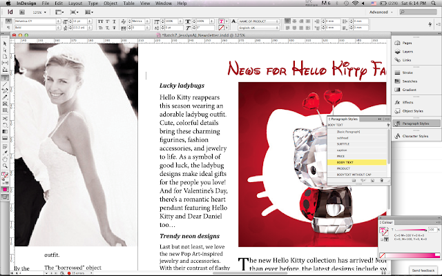
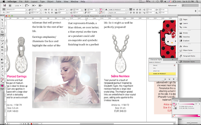
Because Mr. Em said we must use paragraph style and character style, i used them!


using paragraph style 

using character style

Mr. Em gave me some TIPS about font size :

body text = 9 - 11
headline = 11 - 14 
subhead = 10 - 12

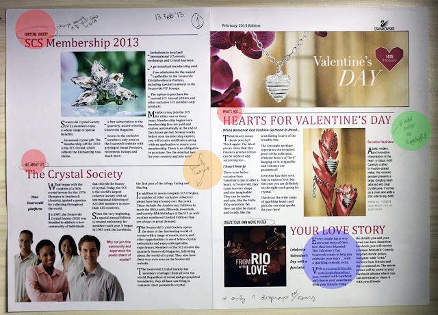
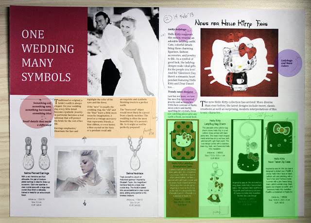
i made page one and page four, then QC ( 13 February 2013 #1 )with mr. Em,
Feedback :
- change font, Gill Sans Lisght for example
- switch content
- add color as highlight
- only one dropap per story
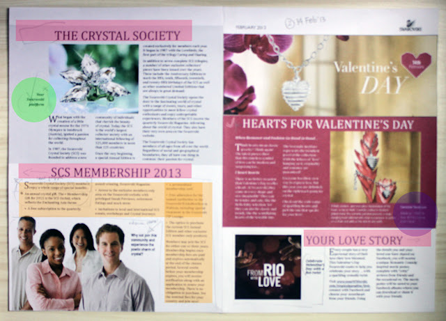
After QC, i edited the page, and QC ( 14 February 2013 #2 )
Feedback :- the title should in a columns with body text
- delete the sentence
- this is the step, make it per point
- this is price of product, maybe would be better if the price is in image 

Feedback :
- the ledding is too far
- add the ledding, so the picture below not awkward
- just delete the sentence- this box little bit messy, make it neat
- leading too far


Mr. Em gave the rule of saving data :
- save as > format > CS 4 IDML
- file > package (if you want to send everything as indesign)
- file > save as > PDF
- file > adobe PDF preset > HQ print

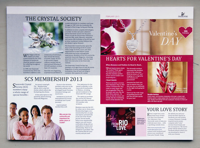
This is the final before i print it (with grids):


Then, i printed them <3


FINALY, ITS DONE! 

 on presentation day ( 15 February 2013 ), mr. Em comment :
- there are some "widow" words 
- Hello Kitty title should above the photo (centre of photo box)
- you should set row and columns as grid in master page, not only in page


I'm very happy and learnt so much things from this project. 
Have a nice recess!
JAJ

Newsletter Exercise (MyFonts) - Indesign

My final project for this term is make a newsletter. Before i made the newsletter, Sir Em told us to try make one as exercise. firstly i used myfonts.com as the material ( http://www.myfonts.com/newsletters/cc/201112.html ) .

To make the assignment easier, i made moodboard first. in this moodboard i put the image that i will put on my newsletter, the color pallet, and the example of newsletter (right bottom, below the color pallet).
Then, instarted make the template. Mr. Em told us to make it in 3 columns minimal, so the paragraph looks neat. for bleed 3 mm is enough. then margin 15mm is enough if you design a newsletter, but if you design a magazine, left margin (for right page) is not enough, or your words and image would be cropped. 


i learnt about A-master, eventhough I'm not really understand yet :B (I'm a beginner T_T) 
The first spread include page one and page 4 (last), it called facing pages


from this exercise, i learnt the function of paragraph style, and character style. Paragraph style is for one paragraph and character style is only for a sentence or word. It makes you easier when you design a book or magazine (so many pages)

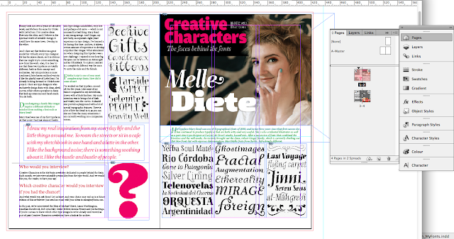
This is the newsletter of MyFonts. 

page four -  page one

page two - page three

I made facing pages, so when i printed them, i just need to fold them. 


Have a nice day!!!
JAJ

Wednesday, January 9, 2013

Indesign (First Lesson)

                  Today i learnt about Indesign in digital design class. Function if Indesign is for desktop publishing, such as : book, magazine, newspaper, promotion collateral, newsletter, poster, brochure, Flyer, and Banner.


Today is our first meeting of indesign lesson, sir Em gave us a sample and format.


We started to design a page, This is the format


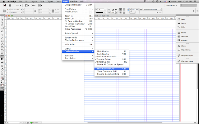
when we design a page of magazine, we need baseline to make sure every word is in line guide.


We added a picture and a title. The title is 'Another Morning Wet Day", it because today is raining since we woke up till we started the class. Then we put an article, only for example. And i put a picture.


Next, i put the text as example.


But if you see the text, there are many '-' and it looks not good. let's make it better. We can turn off the 'Hyphenate'.


This is The result, no '-' in this page, it looks nice :)


And we can try to make paragraph/line looks better in 'Paragraph Style'. But the time is up and this is the result today!

Cheers,
JAJ

Thursday, December 20, 2012

Self Potrait - Photoshop

Hey! I want to share about my second assignment. That is photoshop lesson, make a self portrait picture with several photos that describe me. First i collect some photos that i love. little bit confused about theme and tone, to make it easier i made mind map and moodboard.
After i made mind map and moodboard, i don't know how to mix them all to 1 self portrait picture. i have beach/sea, snow, galaxy, firework, and they are really different theme. I made some sketches and decided to focus on photography, galaxy, sea.
I started to make from bottom to top. first i put the sand and sea. I changed the contrast, level, and color.
then, i put the fireworks.
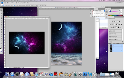
i put the galaxy!
After that i put the camera. i changed the tone and color to make it looks like really in the sea and made by sand.
then i made the moon like glowing by decreasing the opacity, and adjustment, click brush, and erase the layer that in front of the moon.
i put my name that you can download the font from dafont.com (beyond sky) to match it with the sky.
The last i put project name, "self potrait". i used Times new roman to make my name more expose than the project name.
And this is the result! My Self Potrait :)
i learnt so many thing from this project, but i don't satisfied with the progress and the result. :\
Have a nice holiday!!!
- JAJ -