Firtsly, as always, i made a moodboard. It's include the logo, image, color pallet, and fonts.
Second step, i made the sketch. Little bit messy but this just sketch :DD
I started make the newsletter with this, A4, facing pages, 13mm margin, 3mm bleed, and 8 columns (with more columns, it will more flexible to organize the paragraph and image).
Because Mr. Em said we must use paragraph style and character style, i used them!
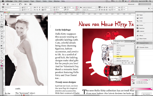 |
| using paragraph style |
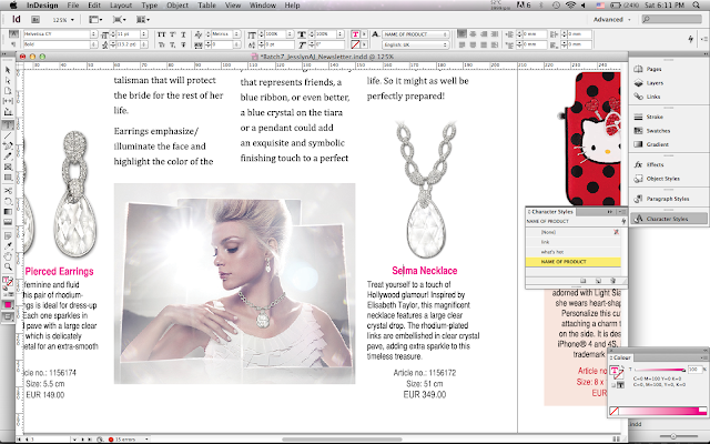 |
| using character style Mr. Em gave me some TIPS about font size : body text = 9 - 11 headline = 11 - 14 subhead = 10 - 12 i made page one and page four, then QC ( 13 February 2013 #1 )with mr. Em, |
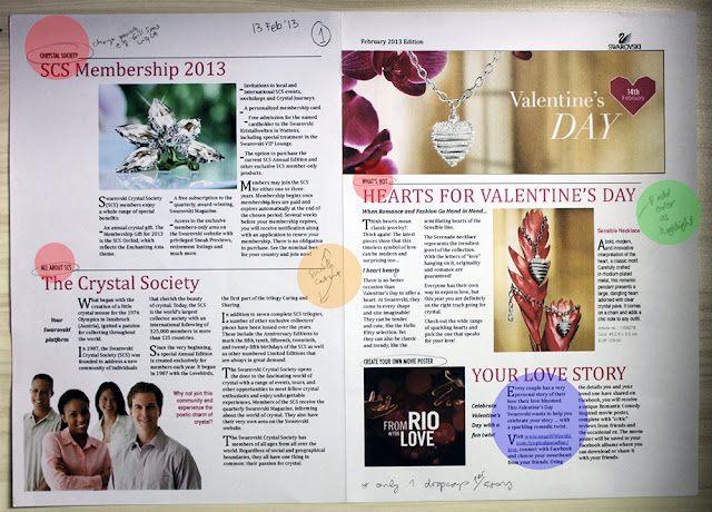 |
| Feedback : - change font, Gill Sans Lisght for example - switch content - add color as highlight - only one dropap per story |
After QC, i edited the page, and QC ( 14 February 2013 #2 )
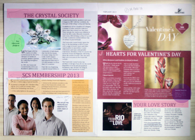 |
| Feedback :- the title should in a columns with body text - delete the sentence - this is the step, make it per point - this is price of product, maybe would be better if the price is in image |
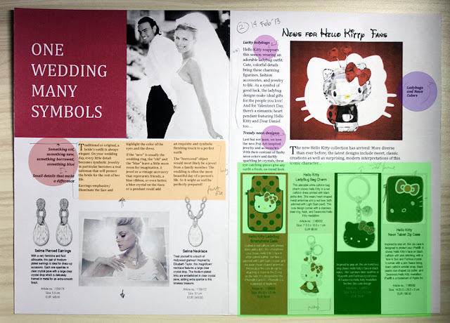 |
| Feedback : - the ledding is too far - add the ledding, so the picture below not awkward - just delete the sentence- this box little bit messy, make it neat - leading too far |
Mr. Em gave the rule of saving data :
- save as > format > CS 4 IDML
- file > package (if you want to send everything as indesign)
- file > save as > PDF
- file > adobe PDF preset > HQ print
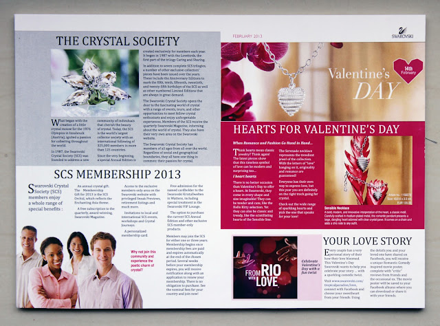
This is the final before i print it (with grids):
Then, i printed them <3
FINALY, ITS DONE!
on presentation day ( 15 February 2013 ), mr. Em comment :
- there are some "widow" words
- Hello Kitty title should above the photo (centre of photo box)
- you should set row and columns as grid in master page, not only in page
I'm very happy and learnt so much things from this project.
Have a nice recess!
JAJ


No comments:
Post a Comment