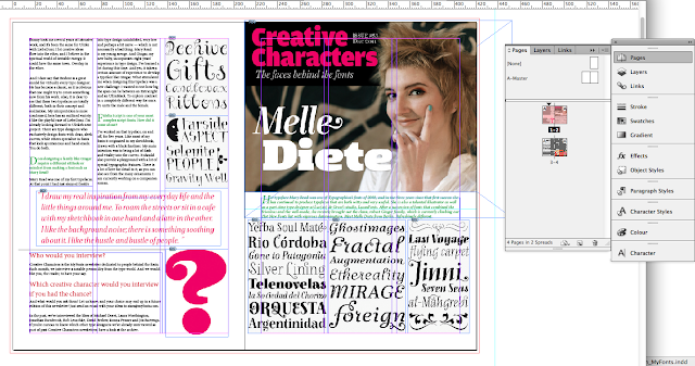
My final project for this term is make a newsletter. Before i made the newsletter, Sir Em told us to try make one as exercise. firstly i used myfonts.com as the material ( http://www.myfonts.com/newsletters/cc/201112.html ) .
To make the assignment easier, i made moodboard first. in this moodboard i put the image that i will put on my newsletter, the color pallet, and the example of newsletter (right bottom, below the color pallet).
Then, instarted make the template. Mr. Em told us to make it in 3 columns minimal, so the paragraph looks neat. for bleed 3 mm is enough. then margin 15mm is enough if you design a newsletter, but if you design a magazine, left margin (for right page) is not enough, or your words and image would be cropped.
i learnt about A-master, eventhough I'm not really understand yet :B (I'm a beginner T_T)
The first spread include page one and page 4 (last), it called facing pages

from this exercise, i learnt the function of paragraph style, and character style. Paragraph style is for one paragraph and character style is only for a sentence or word. It makes you easier when you design a book or magazine (so many pages)
This is the newsletter of MyFonts.
 |
| page four - page one |
 |
| page two - page three |
I made facing pages, so when i printed them, i just need to fold them.
Have a nice day!!!
JAJ


No comments:
Post a Comment