Saturday, March 8, 2014

Note About Typography | Week 2

1. PRINCIPLES AND TACTICS

1.1 TYPOGRAPHY PRINCIPLES

1.1.1 TYPOGRAPHY EXISTS TO HONOR CONTENT

  • Typography is an art that can be deliberately misused
  • It is a craft by which the meaning of a text (or its absence of meaning) can be clarified, honoured and shared, or knowingly disguised
  • Typography must often draw attention to itself before it will be read
  • In order to be read, it must abandon the attention it has drawn
  • Its other traditional goal is durability; not immunity to change, but a dear superiority to fashion
  • Typography at its best is a visual form of language linking timelessness and time
  • One of the principles of durable typography is always legibility
  • Typography also gives its energy to a page including serenely, liveliness, laughter, grace and joy
  • Laughter, grace, and joy, like legibility itself, all feed on meaning, which the writer, the words and the subject, not the typographer, must generally provide
1.1.2 LETTER HAVE A LIFE AND DIGNITY OF THEIR OWN
  • The original purpose of type was simply copying
  • Typography is just that idealised writing
  • In a well-made book, where designer, compositor and printer have all done their jobs, no matter how many thousands of lines & pages, the letters are alive
  • The task of creative non-inference with letter is a rewarding & difficult calling
  • In  ideal conditions, it is all that typographers are really asked to do - and it is enough
1.1.3 THERE IS A STYLE BEYOND STYLE
  • Typography style is the power to move freely through the whole domain of typography, and is function at every step in a way that is graceful and vital instead of banal
  • It means typography that can walk familiar grounds without sliding into platitudes, that responds to new conditions with innovative solutions, and typography that does not irritate the reader with its own originality in a self conscious search for praise
  • Typography is to literature as musical performance is to composition ; an essential act to interpretation, full of endless opportunities for insight or obtuseness
  • Much typography has many uses including packaging and propaganda
  • Like music, it can be used to manipulate behaviour and emotions
  • Typography at its best is a slow performing art, worthy of the same informed appreciation that we sometimes give to musical performances, and capable of giving similar nourishment and pleasure in return
  • The same alphabet and designs can be used for a biography for Mohandas Handhi for a manual on the use and deployment of biological weapons.


1.2 TACTICS

1.2.1 READ THE TEXT BEFORE DESIGNING IT
  • The typographer's one essential text is to interpret and communicate the text
  • Its tone, its tempo, its logical structure, its physical size, all determine the possibilities of its typographic form
  • The typographer is to the text as the theatrical director to the script, or the musician to the score
1.2.2 DISCOVER THE OUTER LOGIC OF TYPOGRAPHY IN THE INNER LOGIC OF THE TEXT
  • The first task of the typographer is to read and understand the text
  • The second task is to analyse and map it
  • Only then can typographic interpretation begin
  • The typographer must analyze and reveal the inner order of the text, as musician must reveal the inner order of the music he performs
  • But the reader, like the listener, should in retrospect be able to close her eyes and see what lies inside the words she has been reading
  • The typographic performance must reveal, not replace, the inner composition
  • Typographers, like other artists and craftsmen - musicians, composers and authors as well - must as a rule do their work and disappear
1.2.3 MAKE THE VISIBLE RELATIONSHIP BETWEEN THE TEXT AND OTHER ELEMENTS PHOTOGRAPHS, CAPTIONS, TABLES, DIAGRAMS, NOTES A REFLECTION OF THEIR REAL RELATIONSHIP
  • Typographic page is a map of the mind
  • It is frequently also a map of the social order from which it comes
  • And for better or worse, minds and social orders change
  • If the text is tied to other elements, where do they belong?
  • If there are notes, do they go at the side of the page, the foot of the page, the end of the chapter, the end of the book?
  • If there are photographers or other illustrations, should they be embedded in the text or should they form a special section of their own?
  • If the photographs have captions or credits or labels, should they sit close beside the photographs or should they be separately housed?
  • If there is more than one text, how will the separate but equal texts be arrayed?
1.2.4 CHOOSE A TYPEFACE OR A GROUP OF FACES THAT WILL HONOR AND ELICIDATE THE CHARACTER OF THE TEXT
  • Choose and use the type with sensitivity and intelligence
  • Letterforms have tone, timbre, character, just as words and sentences do
  • The root metaphor of typesetting is that the alphabet (or in Chinese entire lexion) is a system of interchange parts
  • Letters are microscopic works of art as well as useful symbols
  • They mean what they say
  • Typography is the art and craft of handling these doubly meaningful bits of information
  • A good typographer handles them in intelligent, coherent, sensitive ways
  • When the type is poorly chosen, what the words say linguistically, and what the letters imply visually are disharmonious, dishonest, out of tune
1.2.5 SHAPE THE PAGE AND FRAME THE TEXTBLOCK SO THAT IT HONORS AND REVEALS EVERY ELEMENT, EVERY RELATIONSHIP BETWEEN ELEMENTS, AND EVERY LOGICAL NUANCE OF THE TEXT
  • Selecting the shape of a page and placing the type upon it is like framing and hanging a painting
  • A cubist painting in an eighteenth-century gilded frame, or a seventeenth-century still-life in a slim chrome box, will look no sillier than a nineteenth-century text from England set in types that come from seventeenth-century France, asymmetrically positioned on a German Modernist page
  • If the text is too long or the shape is short, or if the element are many, multiple columns may be required
  • If illustrations and text march side by side, does one take precedence over the other
  • And does the order or degree of prominence change?
  • Does the text suggest perpetual symmetry, perpetual asymmetry, or something in between?
  • Does the text suggest the continous unruffled flow of justified prose, or the continued flirtation with order and chaos evoked by flush-left ragged-right composition?
  • Shaping the page goes hand in hand with choosing the type and both are permanent typographical preoccupations
1.2.6 GIVE FULL TYPOGRAPHIC ATTENTION EVEN TO INCIDENTAL DETAILS
  • Some of what a typographer must set is simply passage work
  • Even an edition of Plato os Shakespare will contain a certain amount of routine text : page, numbers, scene numbers, textual notes, the copyright claim, the publisher's name and address, and the hyperbole on the jacket, the passage work background writing that is implicit in the text itself
  • The typographer can make a poignant and lovely typography from bibliographical paraphernalia and textual chaff
  • The ability to do rests on respect for the text as a whole, and on respect for the letters themselves


1.3 SUMMARY

1.3.1 TYPOGRAPHY SHOULD PERFORM THESE SERVICES FOR THE READER
  • Invite the reader into the text
  • Reveal the tenor and meaning of the text
  • Clarify the structure and order of the text
  • Link the text with other existing elements
  • Induce a state of energetic repose, which is the ideal conditions for reading
1.3.2 TYPOGRAPHY SHOULD HONOR THE TEXT FOR ITS OWN SAKE - ALWAYS ASSUMING THAT THE TEXT IS WORTH THE TYPOGRAPHER'S TROUBLE - AND IT SHOULD HONOR AND CONTRIBUTE TO ITS OWN TRADITION : THAT OF TYPOGRAPHY ITSELF


2. SELECTING THE RIGHT TYPE FOR THE JOB
  • Type has the power to make or break a job
  • Every typeface has a different personality, and the ability to convey different feelings and moods, some more than others
  • Display typefaces, also known as headline typeface, tend to be stronger in personality, sometimes trading legibility at smaller sizes for a more powerful feeling
  • They can evoke strength, elegance, agitation, silliness, friendliness, scariness, and other moods,
  • Text designs, often used for blocks of copy, are more subtle in mood and emphasise legibility and readability
  • Their personalities tend to be whispered, rather than shouted
  • Although typeface selection is a very personal, subjective decision, there are some guidelines and unofficial rules that will help you narrow down your search and ultimately help you make the right choice
3. DESIGN GOALS
  • The first and foremost step in selecting a typeface is knowing your goals
  • As a designed, your primary responsibility is to serve the client using your design and problem solving skills
  • It is not make their job into your own personal award-winning design statement
  • Every job requires a different approach
  • An annual report might call for a typeface with a high degree of legibility that also captures the spirit of the company, but a book might need a face that catches the eye and tells a story
  • To focus your design goals and subsequently the most appropriate typefaces to use, start by identifying the age, attention span and demographic of your audience
  • Different typefaces attract different audience, both subliminally and overtly
  • Children are drawn to easy to read, childlike fonts, seniors to larger setting that have more clarity and legibility, teens to more edgy, expressive designs
  • After you consider your audience, ask yourself how much reading you are asking them to walk away with
  • Once you identify your design objective, you will narrow down your typeface choices considerably
4. LEGIBILITY AND READABILITY
  • Legibility refers to the actual typeface
  • The legibility of a typeface is related to the characteristics inherent in its design including the size of its counters, x-height, character shapes, stroke contract, serifs or lack thereof, and weight, all of which relate to the ability to distinguish one letter from another
  • Not all typefaces are designed to be legible
  • A legible typeface can be made unreadable by how it is set
  • A typeface with poor legibility can be made more readable with these same considerations
  • In choosing a typeface, consider its legibility, and how important that is to your design objective
  • Once chosen, it is up to you to enhance its readability
5. TEXT VS DISPLAY
  • Text type is designed to be legible and readable at small sizes
  • This usually implies fairly clean, consistent, uncomplicated design features, more open spacing than a display face, and thin strokes that hold up at smaller sizes
  • Display type can forgo the extreme legibility and readability needed for ling blocks of text at small sizes for a stronger personality, elaborate and more expressive shapes, and a more stylish look
  • Many typefaces do not adhere to these descriptions, however, and can be used for both text and display
  • When choosing a font, try to see a word grouping set at a size close to what you sill be using
  • It is very difficult to visualise what a 14-point text will look like from a 60 point "a-z" showing
6. SCRIPT, CALLIGRAPHIC, AND HANDWRITTING FONTS
  • Script and calligraphic fonts are in class of their own and can overlap both text and display categories
  • They can be very elegant, formal, classy, or very humanistic, quirky, and quite individualistic
  • Scripts and calligraphic are often used for invitations, announcements, headlines, and initial letters
  • Handwritting fonts are great for informal correspondence as well as ads and brochures requiring more personal, informal look
  • Some jobs require the kind of typographic treatment and interpretation that cannot be achieved with an existing font
  • At times like these the unique talents and skills of a hand-letterer or a calligrapher should be seriously considered
  • The work they do is very specialised and unique and is custom-designed to your exact need. Very invaluable
7. TYPE FAMILIES
  • Type families have even more mileage if they are abatable with small caps, which give you another option to create emphasis without jarring the reader and disturbing the flow too much
8. DOS AND DONT'S
  • Do start with a few basic typefaces and type families, and learn how to use them well
  • Do leave white space
  • Do consider production issues when selecting text type. For instance, when going very small, watch out for disappearing thin strokes, especially when printed
  • Do consider how your type will look a the size you are planning to use it. What looks great at 18 point might look too heavy and lose its elegance at 96 point
  • Don't go too big when setting text, smaller with more leading is often more readable than a larger setting with tight leading
  • Don't set to fit. Decide on a point size that looks and reads the best, and adjust leading and line width (or the length of your copy if possible) accordingly
  • Don't tint type with delicate thins. It might break when printed
  • Don't distort your type with the features available in your page-layout program. Type that has been electronically expanded, slanted, emboldened and condensed look very amateurish and is annoying to the eye
  • Don't let the way a typeface looks on a laser proof be the deciding factor in your selection, as it can look much heavier than the actual printed piece
9. MIXING IT UP
  • When choosing a type-face outside the primary family you are using, there are three things to remember, contract, contract, and contrast
  • A common mistake is to use two or more faces which are too close in style, making he change not noticeable enough to serve the purpose at hand, yet creating a subtle disturbance which detracts from the cohesiveness of your design
  • Combine typefaces when you want to emphasise or separate a thought, phrase or text visually
  • The eye needs to see distinct differences for this to be achieved effectively
9.1 THESE BASIC PRINCIPLES SHOULD KEEP YOU ON THE RIGHT TRACK :
  • Serif vs. sans : There are usually strong design differences between them (unless they are part of a type family) which can achieve the contrast you are looking for
  • Light vs. heavy : This technique is often used for subheads ; using a heavy sans, perhaps all caps, within a body of serif text does the trick very well. NOTE : Make sure you go heavy enough because using the next weight up (e.g. book to medium) often results in a week visual transition
  • Large vs small : Such as from headline to subhead or text. The distinction will be emphasised that much more
  • Wide vs. narrow (or regular vs condensed) : An expanded headline font above an average - width body text, or a logo split in two using this technique can create a very powerful contrast
  • Caps vs. Lowercase : Use caps for one of the settings, particularly if it is short. Stay away from setting lengthy text in all caps, as it dramatically reduces readability

10. ABOUT HIERARCHY
  • A typographic hierarcy expresses an organisational system for content, emphasising some data and diminishing others
  • A hierarchy helps readers scan a text, knowing when to enter and exit and how to pick and shoos among its offerings
  • Each level of the hierarchy should be signalled by one or more cues, applied consistently, across a body of text
  • A cue can be spatial (indent, line spacing, placement on page) or graphic (size, style, colour of typeface)
  • Infite variations are possible
11. REDUNDANCY
  • Writers are generally trained to avoid redundancy, as in the expressions "future plans" or "past history"
  • In typography, some redundancy is acceptable, even recommended
  • For example, paragraphs are traditionally marked with a line break and an indent, a redundancy that has proven quite practical, as each signal provides backup for the other
  • To create an elegant economy of signals, try using no more than three cues for each level or break in a document

12. CREATING EMPHASIS WITHIN RUNNING TEXT
  • Emphasizing a word or phrase within a body of text usually requires only one signal
  • Italic is the standard form of emphasis
  • There are many alternatives, however, including boldface, SMALL CAPS, or a change in color
  • You can also create emphasis with a different font, a full-range type family such as Archer has many font variations designed to works together
  • Of you want to mix font families, such as Archer and Futura, adjust the sizes so that the x-heights align
13. WEB HIERARCHY
  • Most web sites are controlled by hierarchies n an even more systematic way than print documents
  • A site's file structure proceeds from a root down to directories holding various levels of content
  • An HTML page contains a hierarchy of elements that can be one inside the other
  • The sites's organisation is reflected in its interface - from navigation to the formatting of content
  • Typography helps elucidate the hierarchies governing all these features
  • Dynamic web sites use database to build pages on the fly as users search for specific content
  • Databases cut across the planned hierarchy of a site, bringing up links from different levels and content areas - or from other web sites
  • Typographic style sheets are used to weight the informations gathered, helping users find what they need


***
JAJ

Tuesday, March 4, 2014

Type as Image Poster | Exercise 1

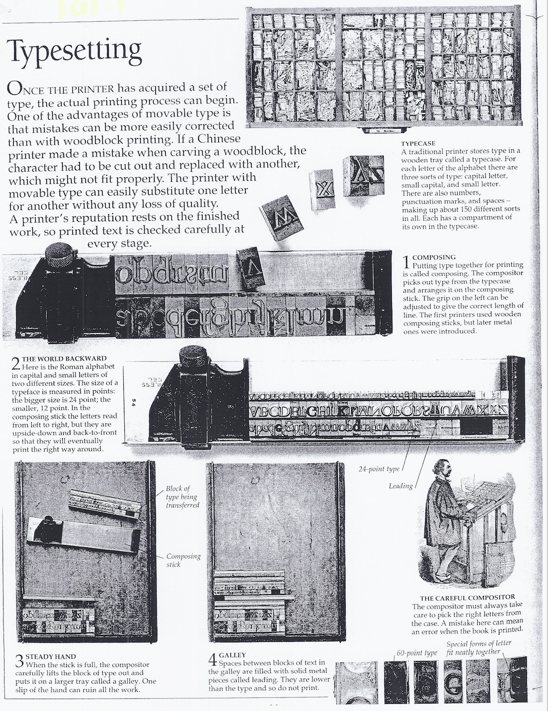
Symbolic Swan Meaning 
Our first symbolic clues from the swan can be taken from observing them in nature. They are waterfowl, closely connected with water, even nesting near the water. 
Water is symbolic of: Fluidity, Intuition, Dreaming, Emotions, Creativity. 
In this respect, we can intuit the swan’s appearance in our lives as an arrow pointing to our dreamier depths and feelings. Furthermore, we get the sense of balance from swan meaning as it lives harmoniously amongst three of the four Aristotelian elements. Grounding herself on earth, lofting to great heights in the air, and winding through waters with magnificent elegance. 

Swan Meaning and Swan Symbolism 
Love 
Grace 
Union 
Purity 
Beauty 
Dreams 
Balance 
Elegance 
Partnership 
Transformation 
The swan may also bear messages of love and relationships. They pair for years, sometimes male-female unions are sustained for a lifetime. When the swan glides upon the waters of our awareness, it might be a symbol of love, and a reminder of the blessings found in our relationships. 

Swan Meaning in Cultural Symbolism 
The concept of partnership is further expressed on a divine level in Hinduism, wherein the swan graces vibrant traditions as the Hamsa bird. In the Saundarya Lahari (translated: “Waves of Beauty,” it’s a text filled with beautiful mantras from the Hindu perspective) two swans (Ham and Sa) pair together, swimming around in the divine mind “living on honey from the blooming lotus of knowledge.” Isn’t that a lovely concept? 
In the Celtic mind, swans and geese were observed in the context of movement. Specifically, the keenly observant Celts noted their transitory nature and the swan’s pattern of migration. Consequently, the sign of the swan urged Celtic intuition to consider changes of mood (water) and heart (love). 
Swan meaning is also linked to Celtic deities with solar associations, like Belanus and Lugh. As solar animals, the swan represents the rising glory of a new day as well as the farewell of an old day with the setting sun. Fittingly, the Celtic goddess Bridgid is also associated with the swan as her grace is expressed with equal elegance in the form of writing (poetry) and song. 
Celtic myth also indicates when inhabitants of the Otherworld required passage to the physical land of life you and I experience every day, they would take the shape of the swan. Furthermore lore states they would travel out of the Otherworld in pairs, thus reinforcing the theme of union, bonds and partnership. 

In Celtic art, gold and silver chains are often depicted around the swan’s neck. I’ve read where this is symbolic of supernatural appearance of divine energy or the descent of gods to earth. I like to think the chains are symbolic of a harmony between cosmic forces; gold representing the sun, and silver symbolic of the moon. Perhaps the Celts recognized the essence of gods within the guise of the swan, and honored that power in the bird. 
We see further themes of transformation and deific embodiment in Greek myth wherein Zeus (Jupiter in the Roman pantheon) transformed himself into a swan in an effort to slake his uncontrollable passion for Leda. 

Swan Meaning in Dreams and Folklore 
Symbolic swan meaning continues the theme of transformation in the tale of the Ugly Duckling by Hans Christian Anderson. Mislabeled from birth, the little duckling lives his life with the heroic heart of a swan. Indeed, after growing strong under the nurturing of kind humans, the duckling is set free, and sees its image for the first time in a reflective pool of water to discover he had “transformed” into a lovely swan. 
Who doesn’t love this little fairy tale? It reminds us of our inherent glory, power and beauty (as the duckling was always a graceful swan). At the same time, the tale encourages us to have faith and have a persistent heart while pursuing the gifts that are our birthright. 
In dreams, the swan asks us to spread our wings and take flight into our waking dreams. She also encourages us to strengthen our relationships, as well as make new, long-lasting bonds with people whom we admire. 

Swan Color Meanings 
White swans in dreams are symbolic of cleansing and purifying ourselves and our lives. Black swans indicate deep mysteries within us that are longing to be set free to express themselves creatively - perhaps as Bridgid would have us do, in poetry or music. 

I hope you have enjoyed this page on swan meaning and symbolism. Keep swimming with the creative flow by visiting the related pages on meaning and symbolism at the end of this page.


I chose swan as my object because swan inspires me about the transformation from ugly duckling become a beautiful swan (change from bad things to be better and better). I want to focus on the characteristic, swan is symbol of grace, love, transformation, elegance, union, purity, beauty, balance, and partnership. I made the poster manually to present the purity. Script typeface to present the elegance. Also i add the love side of swan by adding the story on the wing. The headline "One for Ever" and the tagline "till death do us part" are inspired by swan's love fact that they pair for years, sometimes male-female unions are sustained for a lifetime.


I traced the swan on tracing paper

Scan > Digitize 

for headline


option 1

option 2


love,
JAJ

Introduction | Week 1

The difference between calligraphy, hand lettering, and typeface/font :

Calligraphy = Beautiful Writing
Hand Lettering = Drawing Alphabet (longer than calligraphy because 'drawing')
Font/typeface = have to think about the hierarchy, a meet b,  f meet i, etc, symbol, numbers

* calligraphy and hand lettering don't have to think about symbol and number


Type exist for about 550 years


  • Cave (communication with sound)
  • Egypt (symbol)
  • Trajan (Roman)
  • Guterberg (movable type pieces of metal called matrices) - print bible
  • 16th century > claude garamond, robert granjon)
  • 100 years after > Caslon
  • 18th century > Bodoni & didot
  • 19th century > William Moris
  • Phototype (Linotype machine, invented by ottar mergenthaler (1880s), 100x faster than before)
  • Herb Lubalin (New York designer)
  • Digital Age (hold in the 1980s. 1985 machinates introduced 1st computer by Steve Jobs. Other manufacture made PCs)


NB :

Uppercase & Lowercase (they call this way because they put the capital letter in uppercase, and the lowercase in lowercase)

Leading = between rows 
Kerning = between letters

ITC = International Typeface Corporate

Ascender = example > k
Descender = example > j


*****

JAJ

Introduction Art Direction

WEEK 1


(Regional) Managing Director :

  • Find client
  • Associated with client
  • Maintain quality

1. ACCOUNT SERVICE
a. Account Service (have some account manager)
b. Account Manager (have some account executive)
c. Account Executive


2. MANAGEMENT & FINANCE
a. Think how to sell
b. Office Management - Accounting - Finance


3. MANAGING DIRECTOR (Marketing is here)
a. Media buyer - promotion (Magazine, TV, radio, social media)
b. Researcher


4. CREATIVE DEPARTMENT
a. Creative Director (become a bridge between creative to account service)
b. Group Head (have some art director)
c. Art Director (here we are! think about the concept & idea / conceptual thinking)
d. Graphic Designer - visualizer (graphic designer - designing > technical skill | Visualizer > illustrator)
e. Production (prepare all file to ready to print)
f. Copy Writer


Type of Agency
1. Full service agency (from strategic plan until execution // production)
2. In house agency (launching new product, small scale, example : UDS)
3. Branding Agency (embed image product to client, example : landor, makimaki)
4. Graphic house (just do project, expert in visual, typo, and layout, skillful, example : leboye)
5. Digital Agency (website, application, QR barcode)


WEEK 2

The Consumer communication & purchase process:
AWARENESS > POSITIONING > CONSIDERATION > PREFERENCE > SHOPPING > PURCHASE

Awareness = memperkenalkan
Positioning = menanamkan image product
Consideration = pertimbangan kapan product di iklankan


PARTNER SUGGESTS THE FOLLOWING CONSIDERATIONS IN ESTABLISHING STRATEGY :
  1. Customers attitudes & buying behaviours (Determin who your customers are demographically & psychologicaly)
  2. Brand Strategy
  3. Competitive Strategy (Evaluate past performance, both yours & your competitors & determine what activities , level of spending, & time period produced, the best result)
  4. Advertising Strategy (How do you currently promote your product in your existing markets? which media best suit your needs?)
  5. Trade environment (what are you distributors attitudes forward the brands? what are your competitors' attitudes?)
  6. Other external factors (what resources are available and what unpredictable factors may influence a product's availability of prioring > weather, raw material?)


RESEARCH IS USED MOST OFTEN IN THE FOLLOWING WAYS
  1. To help identity consumers
  2. To help look for new ideas in products or services
  3. To help improve what is offered in products or services
  4. To help pinpoint causes of possible problems
  5. To monitor activities
  6. To help in communications development
  7. To study promotional tools


TARGET MARKET
  • Geographic (location, climate)
  • Demographic (Age, gender, income, education, etc)
  • Psychographic are more personal character of a person (personality, attitudes, value, lifestyle)
  • Behaviours (Daily activities, routines)
  • Product Related (When consumer use the product or service, product time span)


***
JAJ