

Kartini is a women’s magazine founded by Lukman Umar. Kartini magazine first published in 1974 and is very popular in Indonesia. Indonesian language edition published by Kartini Group. Now Kartini magazine has online edition.
Initial Reaction
The first time i see Kartini, i think this is a good magazine because the cover has a good photograph of the model and neat. But when i look at the pages inside, i found a lot of negative things.
Content
Kartini is weekly magazine that discuss about news, women information, health, food, fashion, life style, short story, and overall it’s about information for women.
Aesthetic
There are some advertising that destroyed the next page because different style, and they pack the font because of the budget. Hypenation is fine but i do not like if they have a lot of hypenations. I do not like the images they place because most of them are squares, it make the people just look for a second.
Style
Kartini has a serious concept. Some page they have a serious concept, and some of them have different concept because the advertising next page.
Layout
The layout is quite simple and they always give priority to the context (information). We can see the grids on every page, but sometimes the “neat concept“ make our eyes tired (they pack the text too tight). The margin is good because there is no text vanished to the edge of the bind.
Flow
In every magazine they have same concept but sometimes there is a different the flow of the content order. Sometimes it is like jump to another topics, the equation is only the concept “informative“. The advertising is everywhere and disturbing the content because they cut the content in the middle.
Usability
The information in this magazine really useful and comunicate the articles easily to the readers. The size of the magazine is standart but it is okay for housewive, not too big and not too small. The material of paper is not comfort to read because like dazzle the eyes when reading magazines under the light, it because of the budget.
Typography
Headlines and subheads are bad because they use serif fonts for long subhead and hard to read. There are some part of these content that they use inappropriate font, its really hard to read, full of text, and make the kerning so far in some lines. There are a lot of widow words. But they place the text on baseline, that is a good point. The font they use is serif, it’s fine because the font shows the serious concept of the content.
Color
They use basic colors for this magazine, maybe its because the target audience is women (housewife) that do not really care and pay attention on colors they use. They have the color theme for every spread and it make our eyes not bored to read.
Completeness
There are some advertising that should remove because it men’s problem like the energy, cars, property, eventhough it is okay but somehow they put the advertising in the middle of content and it is disturbing. Astrology is also not really important in this magazine because of the target audience. If i were a housewive and this is the magazine about news and lifestyle, i would like to find about unique tips and trick or fact about house, or lifestyle, something that unique and true but we never think about it.
Audience
Target audience of Kartini is women in B and C class, between 25 to 50 years old.
Details
Kartini Magazine does not pay attention on details. You can look them from the widow word, the font selection, the running head is too big (sometimes the size is same as the headline), and the hypenation. But the color they use can build the look and feel for every topic.
Problem Areas
The big problem of Kartini magazine is the text. They use and pack the text in one spread. It makes some rivers on the words.
Appeal
The cover is quite good and interesting. If i were a housewive or adult, i would like to buy and register for member because of the cover. The image of cover is trustworthy and the headline on the cover give us waranty that “content of this magazine is informative and you should buy this”
- MIND MAP -

- CONCEPTS & MOODBOARDS -
 |
ORGANIZE HOUSE WIFE
The first concept for this re-design magazine is to make women comfortable reading this magazine even though all of the content are serious and informative. It will give you informations about daily news, serial short stories, tips and tricks, health, a bit of fashion, and recipes.
This magazine will look clean and neat. You can see that from the majority white background, neat margin and grids, also real and high resolution images.
We will comply with all existing regulations, depends on target audience, for example : no widow word, readable typefaces, fit leading).
We will use basic colors to support serious and informative feel. Serif typeface will be dominant for body text in this magazine. The keywords are informative, clean, trustworthy, and serious.
From all the ideas, this magazine is made for a busy housewife taking care of her husband, children, and home, so the design will provide informations quickly, readable, and reliable because of its design.
|
 |
SOPHISTICATED
Second concept for this re-de sign magazine is to increase its class to high class. It will make women read this magazine comfortably because of the look and feel to not tense while reading serious informations. It will give you informations about daily news, serial short stories, tips and tricks, health, a bit of fashion, and recipes.
This magazine will look cozy and welcome. You can see that from the majority soft or pastel color as background. Neat margin and grids have become a necessity. We will use high resolution images and illustrations to support some articles to make the reader little bit relax.
We will comply with all existing regulations, depends on target audience, for example : no widow word, readable typefaces, fit leading).
We will use warm and serious colors to support informative and cozy feel. Sans serif typeface will be dominant for body text in this magazine. The keywords are cozy or warm, welcome,trustworthy, and serious.
From all the ideas, this magazine is made for little bit high class women and care about entertainment, so the design will provide informations quickly and relaxing as their purpose of reading (doing something useful on their spare time) - mindset.
|
- CREATIVE BRIEF -


01. CLIENT BACKGROUND
Client
PT. Kartini Cahaya Lestari
Product / Service
Kartini is a women’s magazine founded by Lukman Umar. Kartini magazine first published in 1974 and is very popular in Indonesia. Indonesian language edition published by Kartini Group. In addition to its print edition, there is also its online edition.
About
Kartini magazine is quite old. For December issue of this year, kartini Group asking a young designer to redesign the magazine to make it looks more fresh, up to date, and convenient to read.
Strengths
• They have a gr eat margin
• They use two kinds of paper , glossy and dof f for story (unique)
• They have a gr eat cover photograph that make people inter ested to buy
Weaknesses
• In some cases, they use wr ong typeface (har d to r ead)
• There are some widow wor ds
• They ar e not pay attention on leading
• They pack texts and images into one page, although its too full and audience do not know where to start read the article.
Opportunities
• People buy because the see the cover first, if it is inter esting, they will buy
• People ar e looking for an informative magazine
• People just do not car e with layout and design of the magazine
Threats
• People have high expectations of seeing the cover
• People need a magazine with good design and convinient to r ead
• There are many designers who can design this magazine, at least with
great leading and right typefaces selection
02. OVERVIEW PROJECT
Title
Re-design Kartini Magazine
Background
Kartini is one of old magazines, nowadays people are looking for a good looking and good article magazine, not only informative. Then, if Kartini want to prolong its existence, they must impr ove the design accor ding to the needs of the target audience.
03. DRIVER
Our goal is become the best women’s magazine in Indonesia. We are trying to make a better design by re-designing the layout, paying attention to typefaces selection, paying attention to leading, margin, image selection, and positioning.
Top three objectives are :
• Make this magazine become good looking and informative inside
and outside
• Become one step higher than the magazine exist befor e
• Attract women to buy this magazine
04. AUDIENCE
Women (housewife)
between the age of 25 to 50
They should care about the design because if the content and design are great, they will get information, feel comfort to r ead and r elax, as a the purpose of reading.
05. COMPETITORS
1// Female
Strengths
• They know the target audience, the articles perfectly give in formations
to the audience
• They have r eally neat layout for the whole magazine
• They use high quality and r eal photograph
• They have a good photograph for cover
• They have a good layout for advertising and articles
Weaknesses
• Mostly they use white backgr ound and the magazine become plain
• They use inappr opriate typeface in some pages.
Opportunities
• People ar e looking for fashion magazine
• People ar e looking for a good design magazine
Threats
• There are some people that do not car e with the design
• Some people ar e looking for informative magazine
2// Dewi
Strengths
• They use negative space well and ef fectively
• They pay attention on layout
• They use a high r esolution and good photograph, although the take
from internet
• They have a good paper material
Weaknesses
• The size is too big and heavy , can not bring everywher e
• They have to pay attention to leading on some page
Opportunities
• People ar e looking for the topics of this magazine
• People ar e looking for large image (so they can see the detail)
• People ar e looking for high quality paper material
Threats
• There are some people do not like big and heavy magazine
• There are some design this magazine smaller and can people can bring
it to everywhere
06. TONE
We should make this magazine good looking and people comfort to read, also with a great photograph for cover to attract women’s attention to buy this. If they have bought it once and read its content comfortably, then they will buy it again.
Adjective : Cozy, Warm, Welcome, trustworthy, Neat.
07. MESSAGES
• This magazine should r emain in the initial objective, which is informative
• This magazine not only be informative, but also a good design
• To attract the target audience and invite them to buy this, we s hould make
the audience feel comfort to read the informative articles
08. VISUALS
Overall, the content of this magazine is about women’s lifestyle, daily
news, story, recipe, and fashion. We will use real photograph for cover
and articles, but also some illustrations that are not boring and too
serious for story (fiction)
09. DETAILS
Deliverables
1. A women’s magazine
Limitations / Restrictions
For the cover it must a r eal photograph and following the edition (example : christmas, new year, valentine).
10. FORMAT
Magazine Size
A4 ( 21 cm X 29,7 cm )
Number of Pages
140 pages, including the front cover and back cover.
11. TIMELINE
25/10/13
• Reseach and analyse magazine anatomy
• Evaluate the typography of 3 magazines
01/11/13
• Finding grids and anatomy of newspaper
• Finding and write feedback for 10 spr eads of good design and 10 spreads of bad design
• Find 5 dif ferent topics of magazine
08/11/13
• Making 3 grid systems manually
13/11/13
• Cr eating creative brief
• Find 3 dif ferent types of style in layout
20/11/13 • Revising cr eative brief
• Creating specific information about Kartini
27/11/13
• Cr eating mind mapping
• Making moodboar ds
• Pr esenting the concepts in class
• Sketching layout
04/12/13
• Creating flat plan
• Experiment on dif ferent types of grids
• Making thumbnail sketches of magazine
• Find typography options
11/12/13
• Starting make layout digitally
• Finding for typist
16/12/13
• Layouting, pr ogress of magazine
• Quality contr ol
23/12/13
• Layouting, advertising, pr ogress of magazine
• Quality contr ol
08/01/14
• Page numbering, Pr ogress of magazine
• Quality contr ol
15/01/14
• Finishing whole magazine
• Quality contr ol
22/01/14
• Last checking the file
• Printing the magazine
29/01/14
• Submission day
• Creating presentation
05/02/14
• Presentation day
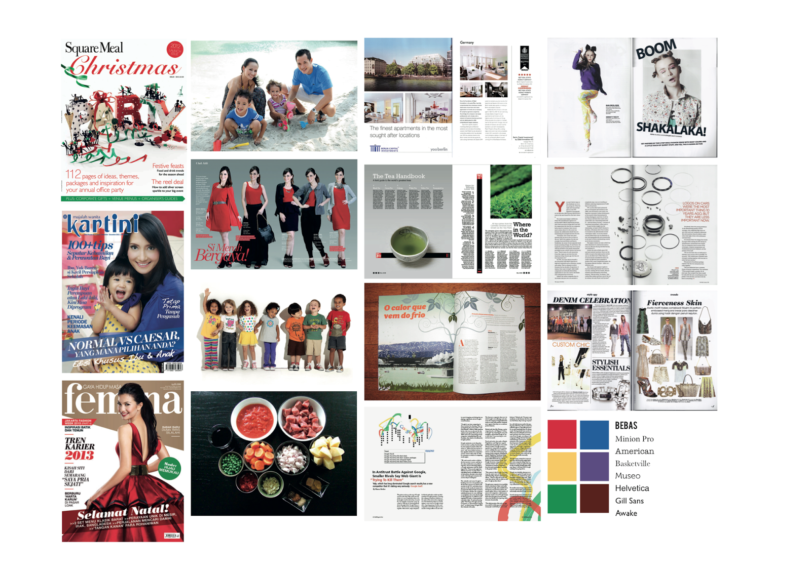
- DISPLAY TYPEFACE CHOICE -


- BODY TEXT TYPEFACE CHOICE -


- COMBINATION TYPEFACE CHOICE -


- COMBINATION TYPEFACE CHOICE -


- FLATPLAN -


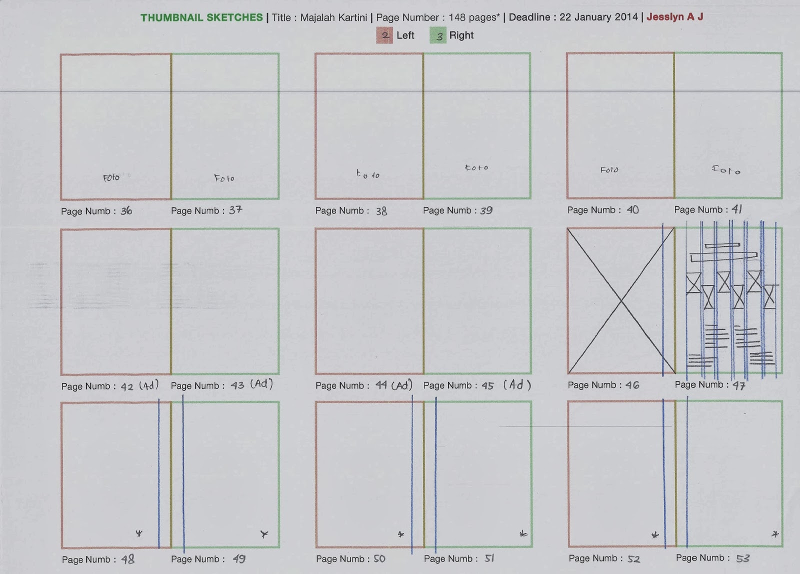
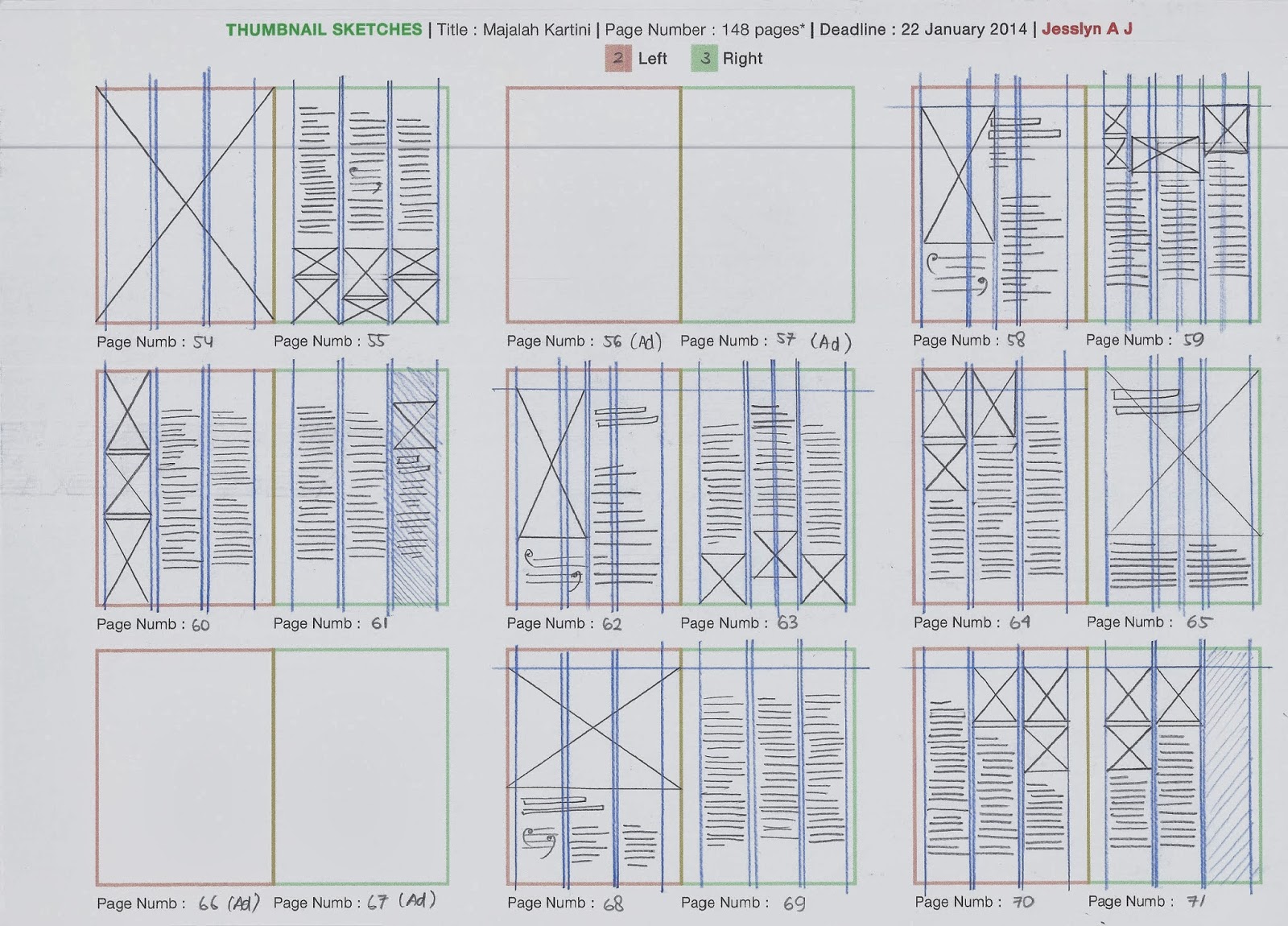
- THUMBNAIL SKETCHES -


- SOME SPREADS HAVE TO RIVISE (feedback & process) -


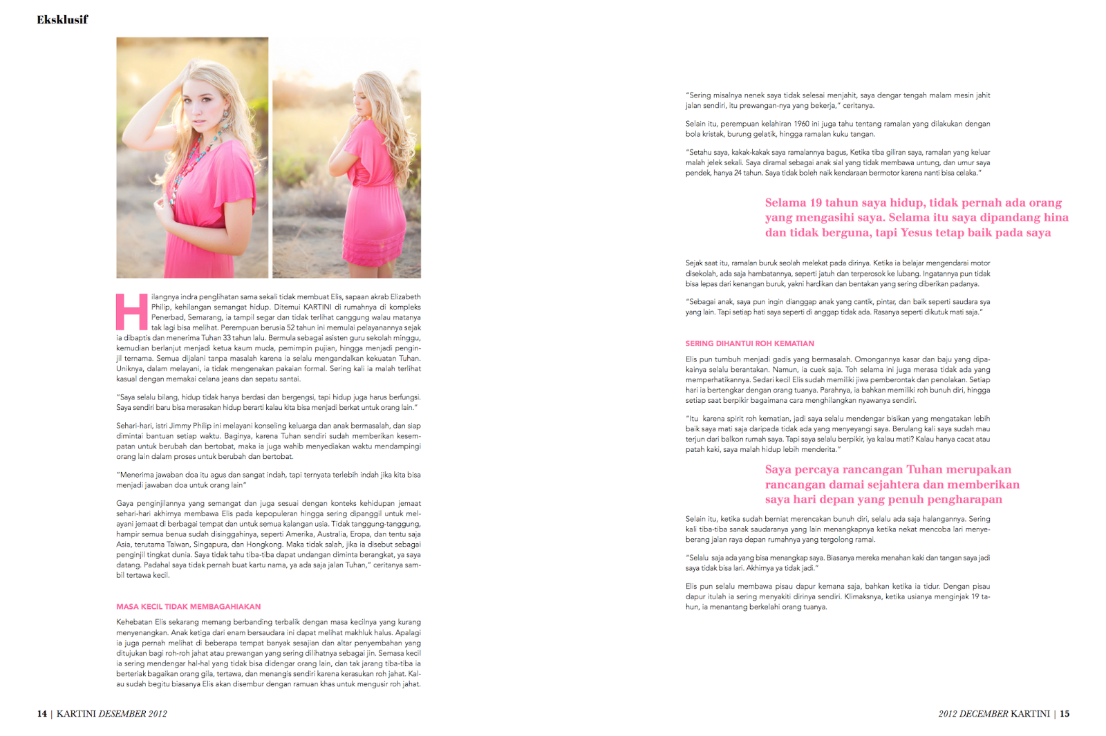
- FINAL SPREADS -


- SOME BEFORE & AFTER SPREADS -


- DOCUMENTATION -
- DOCUMENTATION -


HAPPY EDITORIAL!
JAJ