This week we started to make some campaign stuffs. First and the biggest part is Campaign Proposal. Mr. Angga asked us to make a campaign proposal with a sentence that can promote and sell LOMBOK to Visit Indonesia.
 |
| sketch and plan for campaign proposal |
 |
| Cover of proposal - title, logo, and the 'PT. INDONESIAKU (LOMBOK)' is just made up by me. |
For the next projects, i came up with new concept, that is romantic/warmth/honeymoon, and because the element before (pattern inside the logo) stiff enough, then i made the new one was sketch style, it is for the feel of relax, enjoy, and cozy.
NEXT, i have to make a website for this unforgettable LOMBOK. first, i made some sketches.
 |
| option 1 |
 |
| option 2 |
Then i asked to Mr. Angga and Mr. Anton and they approve some of them but i decided to use the last idea. The normal size is 1024px x 768 px, but i made it on 1024px x 1024px to make it aquare but whn people see it, people want to look something at the bottom, but not so much information, just the information of this official website.
 |
| next page plan |
 |
| next page plan |
then i thought how about loading page. The first one is sunset (the sun will moving from the sky to the sea, and the sea will be by sketch style), the seond one is Gunung rinjani (the fog and the water will be like the real, but there is no sketch style), the third one is a fisher man with a turtle (the fiherman will move from the left to the right, and the percentage of loading will be on the turtle's body). After QC with Mr. Anton, he said to change the sunset become sunrise, OKAY then, looks better.


This is my first design of cover website. The size is 1024 x 1024 px, not as usual. I took the beautiful beach photo, and put some images there. I didn’t put any text on the option because people knew what i meant, right? The sasak house as hotel, suitcase as package, camera as gallery, signage as about, boat as transportation, and shell as contact us. I also put the my logo of LOMBOK, and little bit information about this official website.
My element of sketchy style also when your mouse
over the image. But Mr. Angga againnnn asked me
to change the typeface of ‘welcome to‘
After QC, Mr. Angga said the color of the sky is not really suitable, because my concept for this website is romantic, couple, honeymoon, and warmth. SO, i changed the sky color became little it orange for sunset and warmth. Also change the typeface of ‘welcome to‘ for my sketchy element.
 |
| This is my final website interface. Looks like pastel color. Then i changed the typeface with ‘sketch- me‘ by dafont.com to match it with my sketch style element. |
I have 2 options for gallery page :
 |
| first option - just simple and can change automatically |
 |
| second option - the photo with white transparency but the photo will be clear if your mouse over it. |
I also have 3 options for Contact Us page :
 |
| first option - i put the information on the page (But Mr. Anton banned itt because our inbox will full with people's email and will be junk) |
 |
| second option - this is what Mr. Anton meant, no information, just some box and we should contact the person who email us |
 |
| third option - this is just like win win solution, i didn't put so many information but we should contect the people. |
After QC QC QC, then this is the result :
 |
| Hotel Page |
 |
| Package Page > Tour and Honeymoon |
 |
| tour package |
 |
| honeymoon package |
 |
| Gallery page |
 |
| if your mouse over it |
 |
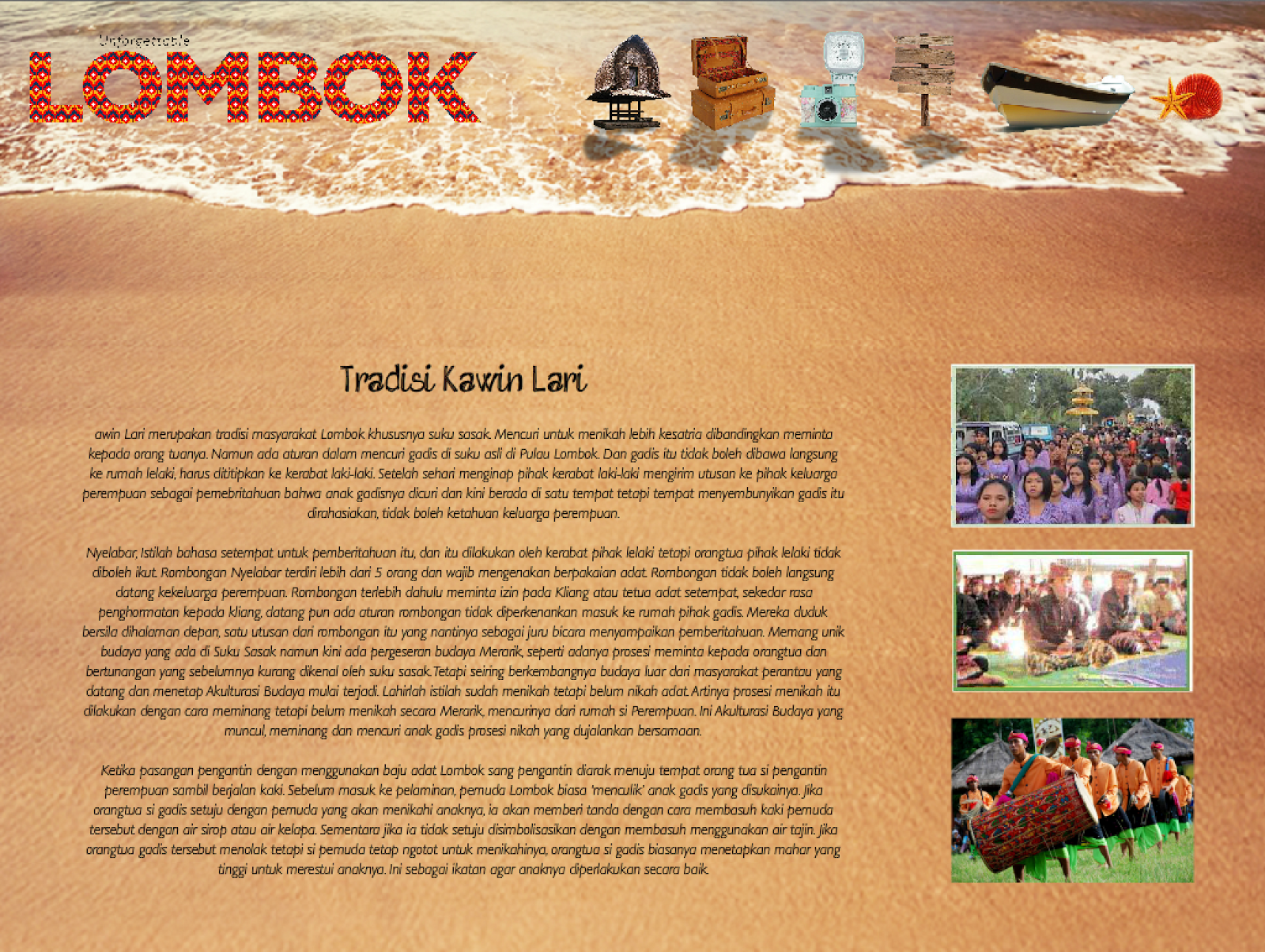
| About page > about lombok > tradisi kawin lari > ayam taliwang > gunung rinjani |
 |
| gunung rinjani |
 |
| ayam taliwang |
 |
| tradisi kawin lari |
 |
| pulau Lombok |
 |
| Transportation page |
 |
| contact us page |
 |
| This is behind the scene of the website. That are a lot of layers. Sometimes makes me corious, but sometimes makes me bored. From this, i learned to make it tidy per layer and divided them by label. |
 |
This is the script of
stop, to make the
animation of every
page stop. This script it
put on the last frame of
the label. If you put at
first or on the middle,
the animation of one
page/label will not
work at all.
|
 |
I learned to make the
page link to other page,
but click the object >
action > add script.
TBut make sure, the
(“hotels”) is the label
of page that we want,
because just a dot can
destroyed everything.
|
Continued to >>> " Re-branding City 4th - LOMBOK (brochure, postcard, poster, voucher) "