Then i made a moodboard. I have search some band, but i just took one or two part of each band. I took the genre from FUN. band. The style of artwork was inspired by The Temper Trap. The sleeve was inspired by P!NK and Lenka album. I made mindmaps and moodboarda to help me do this project :)
I was inspired by Temper Trap the most because it has one photograph that they can apply everywhere (sleeve, poster, CD, DVD, booklet). I have some options, such as bubble, water splash, and bokeh. At the end i chose bokeh as my element. Bokeh is too sad and alone, i think glow in the dark jar can be the next element. I picked blue because it can show the lucid dream and peace feels. I also add pink color as the alternative colour because it can be a perfect match between blue and pink, they also look cool.
 |
| original image of bokeh |
 |
| Original Image of glow in the dark jar |
LOGO
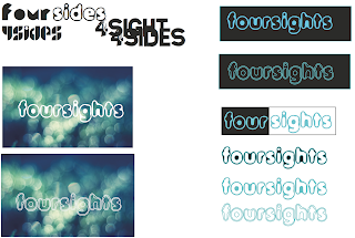
About the logo, i have some options : Foursights, foursides, pink octopus, moody octopus, another story, second meeting, unexpected. At the end i chose foursights because the story is about four people and every people has different point of view.
 |
| sketch logo |
 |
| digital logo |
 |
| final digital logo with bokeh as background. i chose this font because the font i made before was too stiff and doesn't match with bokeh look and feel. |
POSTER
Size of this poster is A3 (29,7 x 21 cm). Firstly i sketched big 5 in every sketch because it is the 5th anniversary of this band, but Mr. Em said 5th anniversaru doesn't have to put big 5 on the poster, it can be small symbol or sentence on the corner.
 |
| poster sketch |
 |
| first digital poster |
 |
| second digital poster |
 |
| final poster |
CD and DVD
Pink and Blue is my basic color of this project, i applied them on this DVD and CD.
 |
| option 1 CD - final |
 |
| option 2 |
 |
| i changed the color of blue jar became pink jar to match it with the DVD background. |
 |
| option 1 - DVD |
 |
| option 2 - DVD |
Sleeve is the hardest part of this project, because i have to think about fold line between every sleeve. I changed the color of first blue bokeh by using previous lesson (solid color and color) in photoshop. I just changed the color to find the different feel and characteristic for 4 personels.
BOOKLET :
Content of this booklet it backround of this band, personels' photos and biodata, and songs lyrics. The background of this band is :
"children playing and singing together everyday with happiness, even though they family financial conditions just sufficient. They were all born in the same year,1984.Adam Levine is the youngest of four siblings, he is very nosy, cheerful and sometimes lazy. Hayley was the second child of two sisters, she was a little boyish girl if compared with her older sister who is very feminine. Nate Ruess is the third child of four siblings, sometimes serious but sometimes he could be joking. Johnny Depp is the first child of three brothers, being the eldest being made he always serious in doing things.
 |
| front cover and back cover |
 |
| band's background |
 |
| personels |
FINAL RESULT 1 (DOCUMENTATION) :
 |
| some inspiration to finish this project :) |
 |
| fresh from the printing machine |
 |
| CD & DVD |
 |
| sticker bonus for this special 5th anniversary edition :) |
 |
| booklet :) |
 |
| A2 size for sleeve :} |
 |
| if you look at the detail, these are some fold line between sleeve |
PRINT :
I print them all IDR 190.000 at Jaya Agung Bendungan Hilir.
2 x Sleeve (A2 @ 65.000) = 130.000 > Art carton
Laminasi A2 = 25.000 > Doff
1 x poster @10.000 = 10.000 > Coronado
booklet = 15.000 > Coronado
CD + DVD stciker = 10.000 > Doff Sticker
FEEDBACK :
- Too much colors inside the sleeve, maybe you should make it one colour, example pink for those four faces.
- The text on back cover, below barcode is too big and the leading too big, make it nice.
- The margin inside the booklet too small.
- Reprint the sleeve and booklet.
- Update blog.
- Input the price and printing place.
Reprinted Sleeve :
The booklet is not really different, but i have changed the margin and looks better.
The sleeve , Blue outside and pink inside, looks better and i like this one :D
JAJ :}


isomediainc is the complete site having the information regarding the CD and DVD replication and duplication.
ReplyDeleteThis is awesome work. I have read the article and it seems to me very innovative indeed. Want to really see some more update here. Keep it up man.
ReplyDeleteCD replication services
This was a great article that really was really helpful to me and I really can’t wait to learn more from your valuable experience. This was really very interesting to me.
ReplyDeleteFlyer and Poster printing
I have not had the capacity to discover such sort of data all around the web search tools and web. It's been remarkably enlightening to peruse your web journal and i am going to recommend it to an alternate individual also.
ReplyDeleteisomediainc.com
Would I be able to simply say, this online journal is the thing that got me as the day progressed today
ReplyDeleteCD Replication
I see that you did a hard inquiry, finishing your best thought alluding to this post. Thus, that sort of occupation scholars do finishing the paper and postulation titles seeking.
ReplyDeleteDVD Replication