Saturday, December 22, 2012

Merchandise - Alphabet

Second Project of Typography class is make merchandise. First Ms. Uma tell us to hunt object around us that have shape like alphabet from A - Z. I made it all on A3 paper.

Then we start to trace them all and draw again.

Now we have A - Z shape, we must design it that we will use the picture in our merchandise product. If you notice, i made 'my alphabet' on 'J' shape that glowing in yellow. J is for my name, yeah Jesslyn :D so i can use it all :B i made J by pencil color, and i chose yellow that describe J is glowing between 'black and white' ;}

I want to make so many merchandise product, but i have no time to go around searching the printing. i want to print my design on T-shirt, Glass, Keychains, passport pocket, Bagage Tag, Hat, canvas bag, etc. Ms. Uma told us about the minimum merchandise is 1 product, but more than 1 will be better. I decided to focus on 3 products, those are T-shirt, Glass, and Keychains. I chose these 3 products because i can use it, so what i made is not useless.

I started to search where is the place that i can print it down all, but every place has their speciality, so i print them all in different place. Keychain and glass are at Surya Photo, near my house. The glass is @IDR 25.000 and keychain is @IDR 8.500.


About the T-shirt, i print at Eska. First i think the place is not too far from my house, i have appointment to go to Eska. 2 weeks ago on Friday i went to Eska and the place so farrrrrrr from my house, 2 hours 30 minutes. The T-shirt price is @IDR 50.000. I chose to print it down in digital (not manual) because digital is faster and the result is much better than 'salon manual'.


i was surprised when i heard my friend print it all more expensive than mine. And this is my merchandise product! :D

Happy Saturday!
- JAJ -

Thursday, December 20, 2012

Self Potrait - Photoshop

Hey! I want to share about my second assignment. That is photoshop lesson, make a self portrait picture with several photos that describe me. First i collect some photos that i love. little bit confused about theme and tone, to make it easier i made mind map and moodboard.
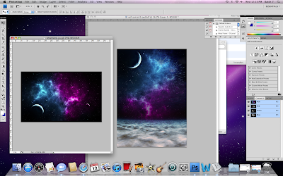
After i made mind map and moodboard, i don't know how to mix them all to 1 self portrait picture. i have beach/sea, snow, galaxy, firework, and they are really different theme. I made some sketches and decided to focus on photography, galaxy, sea.
I started to make from bottom to top. first i put the sand and sea. I changed the contrast, level, and color.
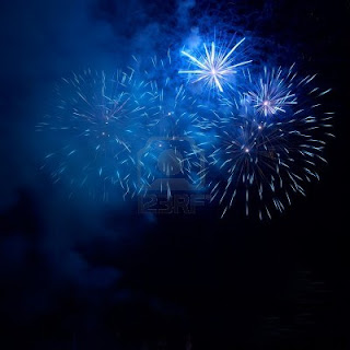
then, i put the fireworks.
i put the galaxy!
After that i put the camera. i changed the tone and color to make it looks like really in the sea and made by sand.
then i made the moon like glowing by decreasing the opacity, and adjustment, click brush, and erase the layer that in front of the moon.
i put my name that you can download the font from dafont.com (beyond sky) to match it with the sky.
The last i put project name, "self potrait". i used Times new roman to make my name more expose than the project name.
And this is the result! My Self Potrait :)
i learnt so many thing from this project, but i don't satisfied with the progress and the result. :\
Have a nice holiday!!!
- JAJ -

Sunday, December 16, 2012

little girl - Charcoal

               One week after i made Katy Perry, i tried to make once again with "true paper". This is my reference : a little girl with her wings, but i just want to draw her without her wings :B


-JAJ-

Katy Perry - Charcoal

                  First assignment of drawing technique is make a black and white painting with charcoal. The process is really fun, but sometimes make nervous when i want to make highlight or shadow :S
i have some option but i chose this picture :
And this is the process :D First i made the grid, so i draw per grid to make the picture look alike.

And this is the result :
To be honest, i don't really like this result, because i think i draw it on wrong paper and make harder :(
God Bless You!
JAJ

Thursday, December 6, 2012

Matthew Cusick – Map Art Collage (Inspiration)

New York based artist, Matthew Cusick has made a name in the art industry by creating intricate artistic representations of humans, animals, and water and landforms made out of carefully crafted pages of recycled maps, atlases, encyclopedias and school textbooks. His map collages are made by meticulously crafting sliced pieces of maps from various old cartographic sources into more lively and familiar forms. Matthew’s map works have gained massive popularity around the world and have been held in numerous collections including the San Diego Museum of Contemporary Art and the Progressive Art Collection. The world has seen his works in various solo and group exhibitions and publications.

Monday, December 3, 2012

Bru - The Street Art (Inspiration)

The amazing world of visual arts does not only ends on the use of paint and canvas, film, photography, design and form. Another awesome variation where most likely almost all the elements of artistry is applied is street art. It is commonly developed in public places in a form of paintings in giant canvases such as walls, windows, roads, bridges and other architectural forms. Over the years, the term is coined with graffiti work that can be called as unsanctioned art, as opposed to government sponsored initiatives. Although this is still somehow true today, more and more street artists have emerged to bring new forms of street art including LED art, murals, stencil art, street sculptures and installations, woodblocking and even video projection. Speaking of street art, one name has emerged to be one of the most popular and influential street artists over the last decade. His name is Blu, an Italian artist who conceals his real identity. He lives in Bologna and has been creating street art since 1999. In the early years of Blu’s career, his technique was limited to the use of the typical medium of graffiti work – spray paint. It was in 2001 when his unique characteristic style appeared. He started painting with house paint, using rollers mounted on top of long sticks which allowed him to increase the size of his canvas and communicate with a stronger intensity. His works are characterized by large human figures, sometimes sarcastic or dramatic that look like they were lifted from comics or arcade games. These massive paintings started appearing along the streets of Bologna around his time.
r
I love his art work because if you look the wall, he tell us some messages. Second reason is i want to draw on the wallsince i was 3 years old but everyone always forbid me to draw on the wall -__- till now i don't have empty wall to draw on it. one day i will make it on my own house :B
Have a nice Tuesday!!
- JAJ -

Sunday, November 18, 2012

Landmark Jakarta Stamp (Katedral Curch) - Illustrator

                  The title of this post is my project :} yeah, my Digital Design project is make a stamp with landmark Jakarta as a picture. I have some options, such as : Bunderan HI, Gereja Katedral Jakarta, Patung Pancoran, Gereja Emmanuel, Gedung DPR, and Gelorang Bung Karno. But i can't choose MONAS, that is forbidden landmark HAHA. Sir Em forbid us to use MONAS picture, he said MONAs is too easy. Honestly i don't know what will i do with this project :B
                   Finally i chose Katedral Church Jakarta as my picture of stamp Project. I made a moodboard that describe Katedral from the main entrance till inside the Church :)

After i send the moldboard to Sir Em, he ask me to start "Tracing". Then, i chose 1 pic
ture. that is the largest size, so when i zoom it in the picture didn't pixelated.
I started trace my Katedral, but i understand why sir Em Monas is too easy, and Katedral is so hard :( when my friend use Monas, she is coloring when I'm in the middle of Katedral tracing.
In the process, there are 3 hardest parts for me. the first glass over the door because it's so detail.
the other hardest part is black metal on the door! :( It's like curly-curly @_@
And the last is the top of this building :|
BUT AT THE END, I TRACED THEM ALL! YEAH! ;)
Little bit confused about the sentence above the door, and I get the information here :)
I don't have that font in my laptop, i have tried one by one font :( But i just put one font to fill it and will ask sir Em soon :B In this project, i just used some tools for tracing.
AND THIS IS MY KATEDRAL! :DDDD
time to coloring! and little bit hard because some line are not connected each other :{ But finally i finished it by add price and name. Printed + polifom + cover sheet = SUMBIT TO SIR EM! :D
Have a nice day!
-JAJ-